How to make a website work properly on mobile
Build one responsive website that remains readable, fast and easy to use across current phones, tablets and desktop screens.
What makes a website mobile-friendly?
Short answer: a mobile-friendly website adapts to the available screen, keeps text readable, makes buttons easy to tap and avoids forcing visitors to zoom. Its menus, forms, calls, payments and tracking must work on real devices, not only inside a desktop preview.
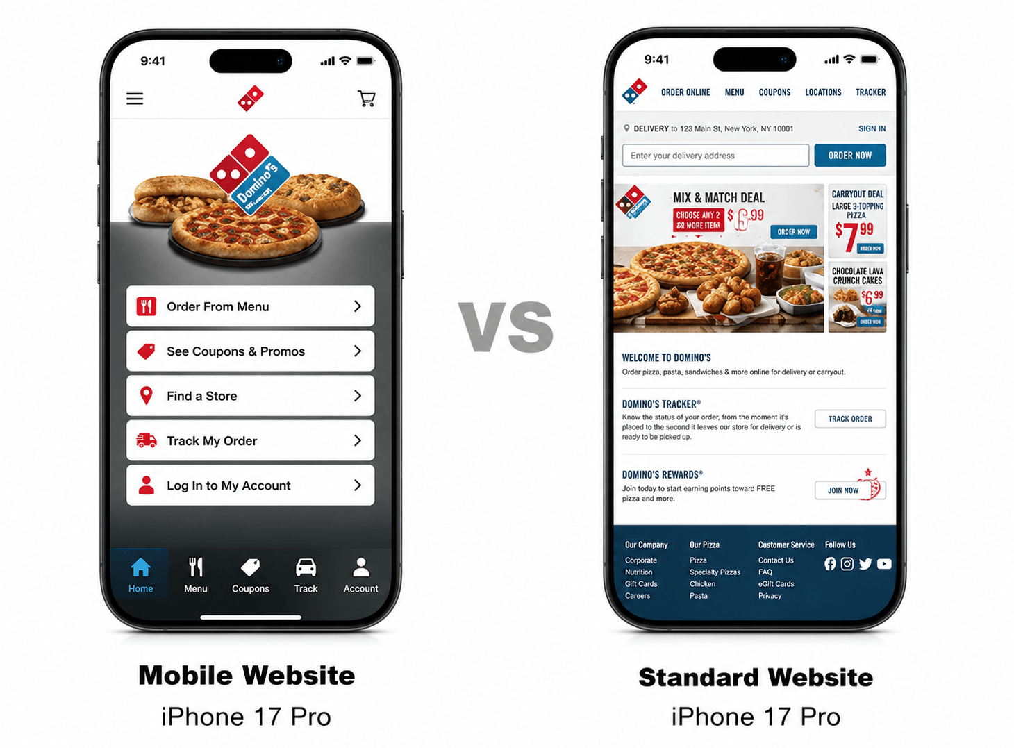
The comparison below says it all. On the left, a proper mobile website gives your customers big tappable buttons, fast access to your menu, offers and contact options, all built for the phone. On the right, a standard desktop site squeezed onto a phone leaves them pinching and zooming through tiny text. When someone is browsing on the go, the mobile-first version is the one that keeps them on your page and ready to buy.
Make it easier for customers to engage with you.
Your customers are mobile. Are you?
Consumers are using smartphones more than desktop computers to:
- Search for your businesses on mobile
- Call to order directly via mobile.
- Get directions on mobile
- Compare prices on mobile
- Read reviews/product ratings on mobile
- Make purchases on mobile
- Share your business through social networks
If your website is slow to load and difficult to navigate on a small mobile screens, visitors will quickly leave. You will lose potential conversions of new customers.
How to test a mobile website before launch
- Open key pages on small and large phones using mobile data as well as Wi-Fi.
- Complete every form, call button, WhatsApp link, booking and payment path.
- Check text size, tap targets, menus, keyboard behaviour and error messages.
- Review Core Web Vitals and investigate slow images, scripts and server responses.
- Confirm analytics and conversion events after the consent choice is made.
Use one responsive website and one clear content source
Leads Dubai Mobile Website
We build responsive websites that adapt across current browsers and screen sizes. One URL and content source make updates, sharing, analytics and search indexing easier to manage than separate desktop and mobile sites.
One URL
Keep the same useful page available across devices. This avoids maintaining separate mobile URLs and gives search engines one canonical version to process.
One step updates
Update the shared content once, then test how the change behaves at common screen widths.
One file
Send only the code and assets needed for the page. Compress images and delay non-critical scripts where appropriate.
One brand
ensures consistency between your mobile and desktop websites branding.
Performance optimizations
Image Optimization which optimizes images for all screen sizes and resolutions reducing load time and bandwidth cost. JavaScript/CSS Optimization reduces load time by never downloading JavaScript or CSS that is unused when accessed from a mobile device.
The power of one plus performance optimizations
Measure results through completed enquiries, calls, bookings or purchases. Do not assume a faster page will fix unclear offers or broken follow-up.
Mobile website features:
- Mobile Click-to-Call Buttons
- GPS Maps & Directions on Mobiles
- Mobile e-Commerce
- Social Media Management on Mobile
- YouTube integration
- Calendars on Mobile
- Custom Mobile Forms
- Image Galleries
- Mobile Reservations & Booking
Read the top 5 points to keep in mind for website design before making mobile website
How to make mobile websites: watch the video

Leads Dubai is a mobile website development company
Frequently asked questions
A proper mobile website gives customers big tappable buttons and fast access to your menu, offers and contact options, built specifically for the phone. A standard desktop site squeezed onto a phone leaves visitors pinching and zooming through tiny text, and when someone is browsing on the go, that difference decides whether they stay or leave.
Visitors leave quickly, and you lose potential conversions. 40% of consumers go to a competitor's website after a bad mobile experience, and a 100 millisecond delay in mobile site load time can lower your conversion rate by 1%.
50% of mobile searches become purchases, which is why a slow or clunky mobile experience directly costs you sales, not just traffic.
Searching for your business, calling to order directly, getting directions, comparing prices, reading reviews and product ratings, making purchases, and sharing your business through social networks. Mobile is now the primary way customers interact with a business before they ever visit in person.
We build custom mobile websites that perform across iPhone, Android, BlackBerry and Windows phones, delivered under one URL that reaches all your consumers on any device. Changes made to your desktop site are instantly reflected on your mobile site, with no additional maintenance required.
One URL reaches all of your consumers on any device faster, which results in optimised mobile SEO, plus easier email and social media sharing since there's only one link to share instead of separate mobile and desktop versions.
Image optimisation for all screen sizes and resolutions to reduce load time and bandwidth cost, and JavaScript/CSS optimisation so the site never downloads code that is unused when accessed from a mobile device. Reducing unnecessary code also keeps the file itself lean, so it loads quickly.
Click-to-call buttons, GPS maps and directions, mobile e-commerce, social media management on mobile, YouTube integration, calendars, custom mobile forms, image galleries, and mobile reservations and booking.
Tell us about your website. We’ll plan a mobile build.
Share your current site, audience and budget. We will review the mobile experience and recommend priorities for speed, search and conversion.
- One URL, one codebase
- Mobile SEO best practices
- Click-to-call & GPS
- Forms and conversion tracking tested
Latest articles on Website Development
Recent insights and how-to guides from the Leads Dubai team.



Web & Content
The website, content and app foundations every campaign converts into.