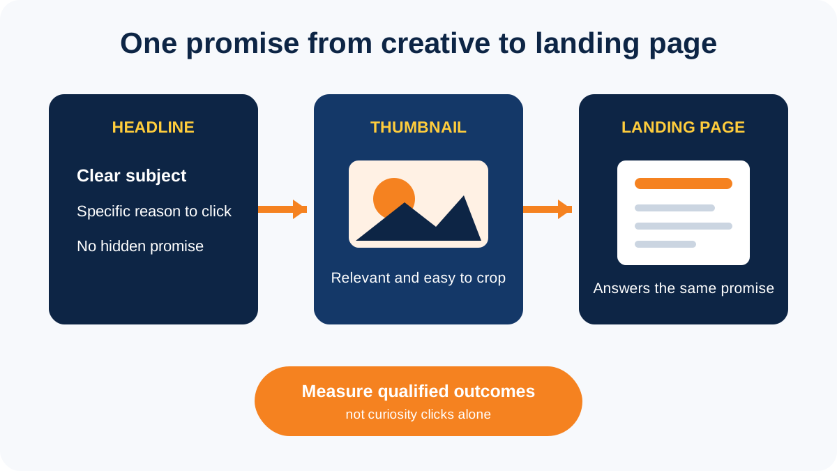
Short answer: a strong native ad pairs one clear headline with an image that makes the same promise believable. The click should lead to exactly what the creative suggested. Avoid vague curiosity, fake news styling and dramatic images that have nothing to do with the landing page. Relevance protects both campaign quality and reader trust.
Native ads appear inside content feeds and recommendation units, so the headline and thumbnail do most of the early work. A polished banner is not the goal. The creative needs to look natural in the placement while still being honest about who is advertising and what happens after the click.
Start with the page, not the headline
Write down what the landing page genuinely gives the reader. It may be a price guide, product explanation, case study, checklist or offer. That is the creative promise.
If the page explains the cost of fitting out an office, the advert can lead with a specific cost question. It should not imply that a government report or breaking-news investigation sits behind the click. A dramatic headline may win cheap traffic and still fail to produce a serious enquiry.
The useful sequence is:
- Define the reader and the problem
- Confirm what the landing page answers
- Write several accurate headline angles
- Select images that support those angles
- Preview the complete creative in each placement
- Measure qualified actions after the click
Write a headline people can understand quickly
A native headline usually has little time to explain itself. Put the subject in plain language and give the reader a real reason to continue.
Useful headline angles include:
- A direct question: “What does an office fit-out cost in Dubai?”
- A practical guide: “A buyer’s checklist for comparing business setup quotes”
- A clear problem: “Why qualified property enquiries stop replying”
- A specific explanation: “How service businesses can check lead quality before blaming the campaign”
These are illustrative examples, not campaign performance claims. The right wording depends on the offer and the page.
Avoid headlines that withhold the subject, promise a result the page cannot support or create false urgency. Also avoid squeezing the company name into every version. The disclosure and brand field already identify the advertiser on many native placements.
Choose a thumbnail that adds context
The thumbnail should make the headline easier to understand. Use a real product, relevant place, recognisable situation, useful diagram or genuine team image when permission is clear.
Check the image at mobile size. Important details should remain visible when the publisher crops it to landscape, square or portrait. Keep the main subject away from the outer edge and avoid tiny screenshots that become unreadable.
Taboola’s published creative guidance recommends avoiding text inside the image. That is a sensible default because text can be cropped, duplicated by the headline or become too small to read. Confirm the current specification for the platform and placement before exporting final files.
Do not use:
- an unrelated stock photo selected only for shock value
- a before-and-after image that implies an unsupported result
- a news logo or page design that suggests editorial endorsement
- a celebrity or customer image without permission
- small text that disappears on mobile
Make the headline and image work together
The headline and thumbnail should carry one idea, but they do not need to repeat each other.
For a guide about reducing event no-shows, the headline can name the problem while the image shows a simple registration-to-reminder journey. For a property article, the headline can ask a buying question while the image shows the relevant property type rather than a generic skyline.
Use this review:
- Can someone understand the topic without guessing?
- Does the image relate directly to the headline?
- Does the landing page answer the promise?
- Is the advertiser identified correctly?
- Is the advertising disclosure visible in the placement?
- Would the creative still make sense after a mobile crop?
Google Ad Manager’s native ad guidance describes the headline, image, destination URL and logo as separate creative elements and requires a clear advertising disclosure in the rendered format.
Test one useful difference at a time
Do not upload a pile of unrelated headlines and images and then call the best click-through rate a winner. You will not know what caused the difference, and the most-clicked version may bring the weakest enquiries.
Start with one landing-page promise. Test headline angles against a consistent image group, or test image treatments against a consistent headline group. Label every combination so the result can be traced.
Judge the creative using:
- click-through rate
- landing-page engagement
- completed forms or purchases
- qualified-lead rate
- cost per qualified outcome
- rejection and policy-review patterns
The final business metric matters most. A lower click-through rate can be acceptable when the wording filters out people who were never a fit.
Keep a simple creative record
For every version, record the headline, image file, crop, landing page, launch date and result. Note why a platform rejected or restricted a creative. This prevents the team from repeating the same weak idea three months later.
Refresh a creative when performance declines, the landing page changes, the offer changes or the image no longer represents the service. Do not change a working advert only because it looks old to the internal team.
Our native advertising service in the UAE covers platform selection, creative direction, tracking and campaign management. For a platform-specific campaign, see Taboola advertising in Dubai. Programmatic display planning is covered separately on our programmatic advertising page.
Native creative questions
What makes a good native ad headline?
It is clear, specific and faithful to the page behind the click. It gives the right reader a useful reason to continue.
Should a native ad thumbnail contain text?
Usually no. Text may become unreadable when publishers resize or crop the image. Check each platform’s current specification.
Should the headline and image say the same thing?
They should support the same promise. Let the image add context instead of copying the headline word for word.
How many creative versions should be tested?
Use enough versions to compare one meaningful difference within the available budget. There is no reliable universal number.
Do native ads need an advertising label?
Yes. The placement should disclose that it is advertising, and the creative must not mislead readers about its source or destination.