Social media image sizes that work across platforms
Short answer: start with the shape, not a separate design for every platform. Use 1:1 for flexible feed posts, 4:5 for mobile feed space, 9:16 for Stories and short video, and 16:9 for wide video and link graphics. Keep logos, faces and important text away from the edges.
Exact platform specifications change, but aspect ratios are much more stable. A clean master design can usually be adapted into four shapes without rebuilding the campaign from scratch. Export at a high resolution, preview it on a phone and check the placement before publishing or buying media.
Quick social media size reference
| Platform and placement | Useful working size | What to check |
|---|---|---|
| Facebook and Instagram feed | 1080 x 1080 or 1080 x 1350 | Use square for flexibility or 4:5 portrait for more mobile screen space. |
| Instagram and Facebook Stories or Reels | 1080 x 1920 | Use 9:16. Keep text and logos inside the central safe area. |
| X profile and header | 400 x 400 and 1500 x 500 | The profile image displays as a circle, so do not place details in its corners. |
| LinkedIn single-image post | 1200 x 627 | Preview desktop and mobile. Square or vertical creative may suit mobile-led campaigns. |
| YouTube channel banner | 2560 x 1440 | Keep the channel name and core message inside the central safe area. |
| YouTube video thumbnail | 3840 x 2160 | Use 16:9, a clear subject and very little text. |
| YouTube Shorts thumbnail | 2160 x 3840 | Use 9:16 and check how it crops outside the Shorts feed. |
| Pinterest standard Pin | 1000 x 1500 | Use 2:3. Taller designs may be cut in the feed. |
| Snapchat vertical creative | 1080 x 1920 | Use 9:16 and leave room for interface controls. |
Why safe areas matter
A file can have the correct dimensions and still display badly. Profile icons, captions, buttons and device crops can sit over the creative. Put the subject, logo and main message in the middle portion of the design. Background colour and non-essential decoration can extend to the edges.
For paid social, check the actual placement preview in the advertising platform. A feed ad, Story and Reel can use the same campaign idea, but they should not rely on the same crop. If a platform automatically adapts one file, review every generated version before launch.
A practical workflow for UAE campaigns
- Create one clear master concept. Decide the image, headline and action before resizing.
- Produce the four core ratios. Make square, portrait, vertical and landscape versions.
- Keep bilingual text readable. Arabic and English need enough room and should not be squeezed against platform controls.
- Export a clean file. Use JPG for photographs and PNG when sharp graphics or transparency matter.
- Preview on a real phone. Check legibility, cropping and the first frame of video.
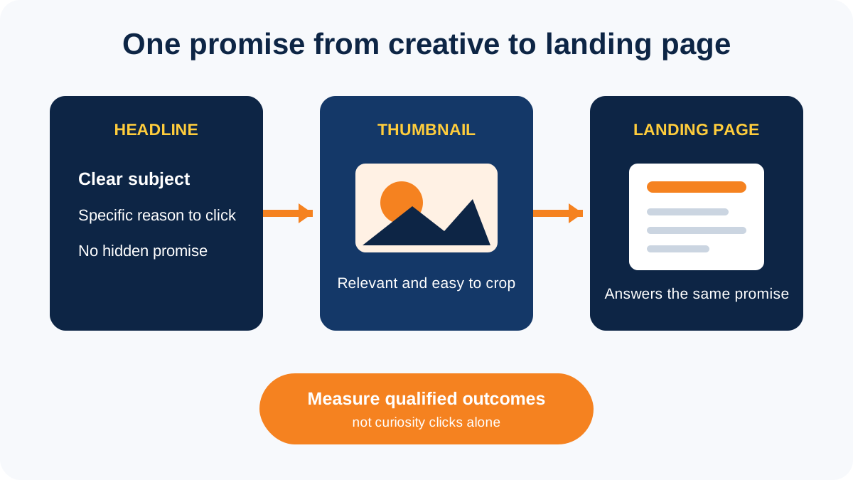
- Test the message, not tiny design changes. Compare a different image or promise before testing small colour changes.
The correct size protects the design, but it cannot rescue a weak message. The image should make the subject clear within a second and support the next action. For campaign help, see our social media marketing services or learn how to build a practical social media strategy.